2011 Etón Catalog
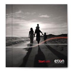
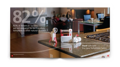
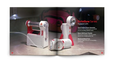
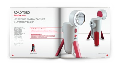
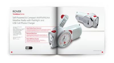
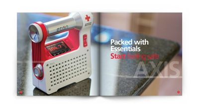


The American Red Cross
co-branded products are geared towards the family setting to help people get prepared for the unexpected. At the same time eliminating the fear factor.
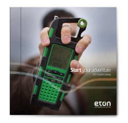
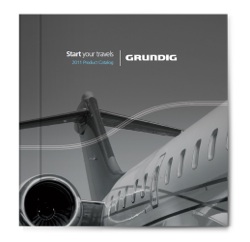
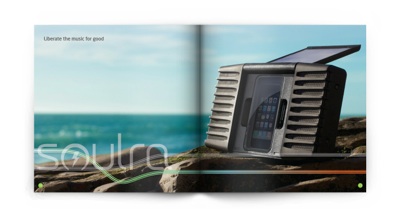
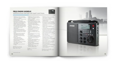
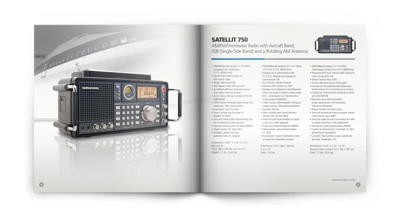
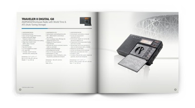
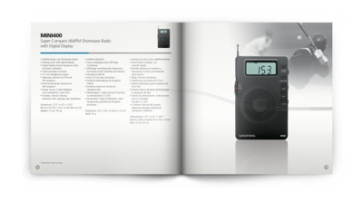
The Grundig product line, geared towards the traveling, global individual whom is keen on tuning in.


Ideally, the printed piece wants to promise a service, a product, a thought, a call for action. Throughout my career as a graphic artist, print media has always been a fascination and a passion. It sort of sets things in stone and makes things official. Watching a product come off the press has been the greatest thrill in the field of graphic design.
I look forward to doing more meaningful designs
through print.
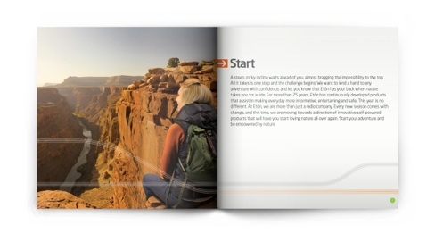
For the past 5 years at Etón,
I was in charge of designing the company’s product catalog. Implementing as well as art directing the companies corporate look and feel through layouts, icons, secondary vector graphics and direction of photography.
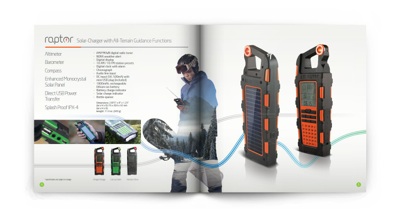
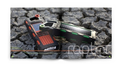
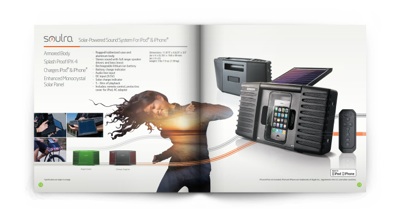
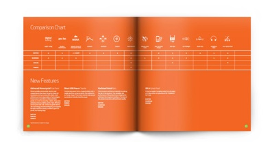
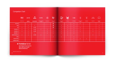
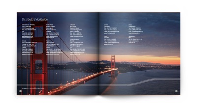
Etón consisted of 3
sub-brands which challenged the designer to give flavor and consistency throughout all marketing material. The adventure line, the safety line and the Grundig line, all having to work as one unit but at the same time have elasticity and uniqueness. In previous years these three monsters were jam packed into one catalog, this year the company tried something new, separate the three messages into three
separate catalogs.